Preprocessor Support in Brackets
I’ve loved Brackets from day 1, but as someone who uses Sass for nearly all of his personal projects, the lack of preprocessor support has ranged from a minor inconvenience to a real pain. And that’s one of the reasons I’m incredibly excited about the latest release of Brackets. We’ve started to add support for preprocessors to some of Brackets’ innovative features.
The latest release (Release 43) adds support for LESS and SCSS files when you’re using Quick Edit, Jump to Definition, and Live Highlight. The one I’m most excited about is Quick Edit. Now when you’re using the inline editors to see the code that applies to a particular element or class, you’ll see your LESS or SCSS files alongside the processed CSS files. That means you can jump directly to your preprocessor code where the styles are actually defined, edit those, recompile them, and see the changes.
I’m also stoked about the live highlight feature for LESS and SCSS. With it you can put your cursor on a definition in your LESS/SCSS files and if you’re in live preview mode you’ll see the live highlight box in all the places that definition applies. It’s a really nice way to see where your preprocessor styles are actually being applied.
I did a quick video (below) showing some of these in action. We’ve got a lot more planned. I want to get regular Sass syntax support for these features as well as see if we can make Live Preview work with preprocessors.
=Ryan
Posted Sep 11, 2014Taking on a (Slightly) New Role at Adobe
It’s been about a year and a half since I jumped from evangelism to product management at Adobe. In that year and a half I’ve been on a bit of a crash course, sometimes skidding against the wall, sometimes making a solid turn. But I’ve learned a tremendous amount and it has been immensly rewarding to talk to customers and build software that they use.
Which is why I’m really excited to be able to announce that I’ve got a slightly new, expanded role. In addition to the “PSD Lens” project we’ve been working on, I’m taking on the product manager role for Brackets. All of this is under the umbrella of “Coding for Design” which is what my focus is going to be going forward.
It’s going to be an exciting ride and I think that coding for design fits in perfectly with Adobe’s focus on creatives. We’re seeing design and development start to intersect incredibly creative people embrace code on the web. There is a broad spectrum of roles with varying degrees of design and development required and Adobe is in a great position to provide tools and services along that spectrum. The most exciting part of the spectrum for me is where design meets front end development.
We have a platform in Brackets on which to test and deliver some innovative ideas for designers who code and developers who touch design. And there are lots of ways that we can embrace modern web techniques in our exsiting tools to make them more efficient where design and development intersect.
If you have thoughts on coding for design, or are up for talking about how you work and the tools you use, I’d love to chat with you. Feel free to drop me an email - ryan@adobe.com.
=Ryan
Posted Jul 8, 2014Updates to PSD Lens and Parfait
Today most of the major updates happened elsewhere and there are some fantastic new releases of Muse and Dreamweaver that have a ton of features for web designers. But last week there were a couple of small things that happened that are worth sharing.
One, “Project Parfait” added support for relative measurements for font sizes. They’ve also started adding support for preprocessors and frameworks so you can copy code that works with Sass with Bourbon and LESS and Hat. To use relative measurements you just select the relative measurement you want to use, set a base font, and your fonts will be automatically converted to rems or ems.
The other thing that happened last week is that my team provided an update on the “PSD Lens”/comp to code tool that NJ showed at MAX last year. I’ve been working on that project the past couple of months and I’m really excited about sharing more over the next couple of months. The video is below and we’ve got a survey where you can sign up for the private beta that we’re hoping to roll out soon.
Posted Jun 18, 2014Source Serif Pro Available on Typekit
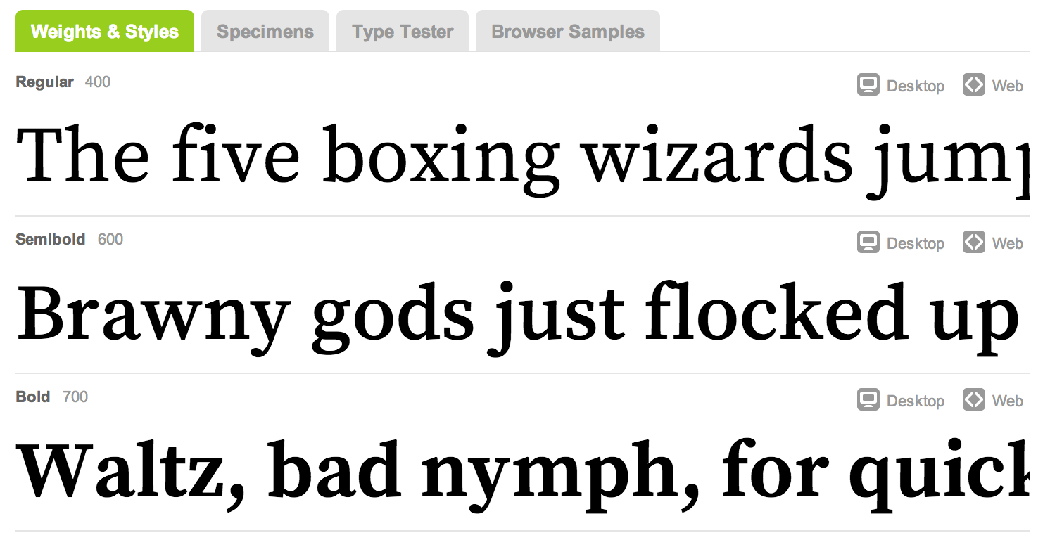
According to the Typekit blog, the newest open source font from Adobe, Source Serif Pro, is available via Typekit. I love the entire Source family (Sans Pro, Code Pro, and now Serif Pro) and it’s what I use on this site.
The blurb on Typekit does a great job of describing the font
A fresh take on the transitional style, Source Serif was designed as a companion to Source Sans. Their close relationship was achieved through a careful match of letter proportions and typographic color. Designed for a digital environment, the letter shapes for Source Serif are simplified and highly readable. The historical background, in combination with a high technical standard, gives the typeface a strong character of its own, lending itself to setting extended text on both paper and screen.
Currently there isn’t an italic version, but it’s in the works.
In addition to using it on Typekit, you can keep tabs on it over on Github.
Posted May 27, 2014Using the Creative Cloud to Manage Web Assets
In putting this site together I’ve been trying to dogfood as much as possible. So I did the initial site design in a PSD, used our design comp to code tool to pull out information, and am storing the entire thing in the Creative Cloud. So far it’s been a pretty smooth experience. And one thing I’ve discovered is that the Creative Cloud’s file Activity tab is incredibly helpful for managing web assets.
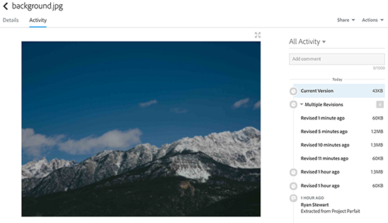
You’ll notice this site has a gigantic image as the background. When I initially extracted that asset, it was 1.3 megs. Not ideal for web download. So I took it into Photoshop’s save for web, cranked the quality down to zero which got the file size down to 60k, and overwrote my inital file.
Because I was storing it in the Creative Cloud, it kept both copies. I could easily compare the sizes (easy, 60k beats 1.3 megs), and I could switch back and forth between them to see the quality. This gave me an idea. Couldn’t I test other optimization techniques and compare all of them?
So that’s exactly what I did. I pulled out the same image using the Project Parfait web interface, and overwrote my inital file (a larger 300k even with quality set to zero). I also ran the original through imageoptim to see what impact it had (got me down to 43k). What was incredibly handy was that I could go to the Creative Cloud web UI and restore the original whenever I wanted to run a new optimization test.
And because file sync would kick in every time I restored a new version, git would pick up the changed file making it easy to commit the changes.
I could see this being really helpful for developers who are working with designers that want final say over assets. Most of the developers I’ve talked to are in charge of doing image optimization on their assets. And in general the tools they use may not result in a loss in quality. But with this workflow, the developer can run whatever optimization tasks they need to, those optimizations are automatically synced to the Creative Cloud, and the designer and go through the revisions to make sure the optimized version looks good. If it doesn’t, the designer can simply restore the version they want, leave a comment, and the changed file will sync to the developer’s machine. The developer can see the change whenever they do a git status.
You get all the benefit of source control but designers can look at (and control) things visually while the developer can continue to rely on the tools they know.
Posted May 18, 2014The New Digital Backcountry
Once again, I’ve rebooted my blog. I hope it will stick this time. In the almost-year since I posted last, I’ve started working on a couple of new projects on the web team at Adobe. One is a design comp to code workflow tool that’s based on Project Parfait. The other is around on-device preview that I’m excited to talk more about in the coming months.
I’ve also started trying to use the Creative Cloud more and more. As the team has added features, it’s become potentially very interesting for web designers. I’ll be spending some time talking about how to use some of the features of the Creative Cloud in a web context.
Mostly though, I just missed writing. I really miss the connection I felt like I had with people who came across my blog, and while Twitter is nice, I still have faith in long form content. So I’ll give it a go and see what sticks.
This design should definitely be considered far from final. I’ve got quite a few tweaks I want to make including adding comments, polishing up some of the menu items, and fleshing out a few more pages. But I figured it’s better to start somewhere.
Posted May 18, 2014
